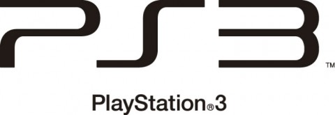
At GamesCom, the PS3 wasn’t the only thing that got smaller. The entire PlayStation 3 branding was revamped to improve visibility. According to Kazuo Hirai, “when you have PlayStation 3 spelt out, the aspect ratio was such that if you wanted it on a billboard it became tiny. It didn’t work in terms of visibility.” The logo no longer uses the Spiderman font to sell out the entire system name; instead, it is now just “PS3” and uses a new font.
Kazuo Hirai on PlayStation 3 rebranding:
“We wanted to make sure that we set a new direction for the PS3. The PS logo with the capital P and small S has always been our logo, has always been synonymous with video games and I wanted to reset the thinking. Also internally I wanted to send the message internally that we are resetting the thinking, going back to our roots. What better way to do it than by resetting the logo? That puts the entire organisation on its toes. On a practical level, when you have PlayStation 3 spelt out, the aspect ratio was such that if you wanted it on a billboard it became tiny. It didn’t work in terms of visibility.”


The old one was better
Hate The New Move for sony /…..from the PS3 slim to this
nah this one is good too
This logo is a step back? Why not keep the current one?
i liked old one. ps2 & ps3 looks similar at my home.
The Old One Is Better
sony are starting to enjoy more more than nintendo!
[…] the recent logo changes to the PlayStation 3, Firmware 3.0 is likely to bring about a change to the boot screen. A video […]
I prefer the old logo too, or at lease the shortened version with the same Spiderman font (like the one in the thumbnail).
Hmmmm
if there was a ps3 slim from the beginning and chrome style , there won’t be any stories damn sony likes to come with ideas ….. that are so dramatic anyways its cool lol think of having a psp slim …
ehhh
old one does look better than this